Let's take our experiments installing Tailwind CSS and building a nav with it to the next level. Today, we're going to be building a simple todo app with Vue.js, Laravel, and Tailwind. For the sake of time, we're not going to persist any data. But fear not, that will certainly make an excellent part two.
Set Up
To get started, I'm going to use the Laravel CLI to scaffold a project by running laravel new <insert-your-project-name> inside the directory where we want to add our project. The Laravel CLI will take care of all the installation that we need for Laravel and Vue.
For this simple project, let's just use the default welcome.blade.php file to build the app. We'll need to configure this template so our Vue code can hook in and work correctly. To start, add in the following meta tag to our head right below the other meta tags.
<meta name="csrf-token" content="{{ csrf_token() }}">
Now, we can delete the default styles and font import and move onto the body. Inside our body tag, we can see a bunch of generated code. Go ahead and replace it with the following:
<div id="app">
    <example-component></example-component>
</div>

<!-- Scripts -->
<script src="{{ asset('js/app.js') }}"></script>
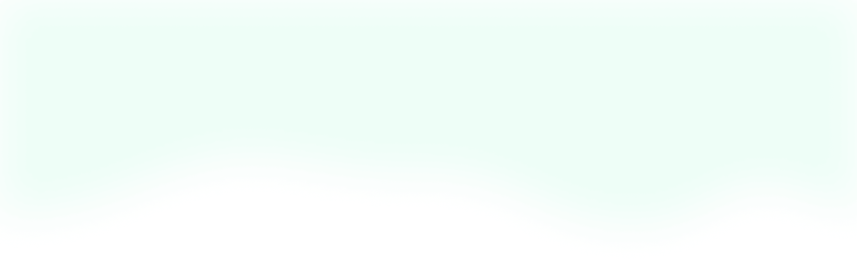
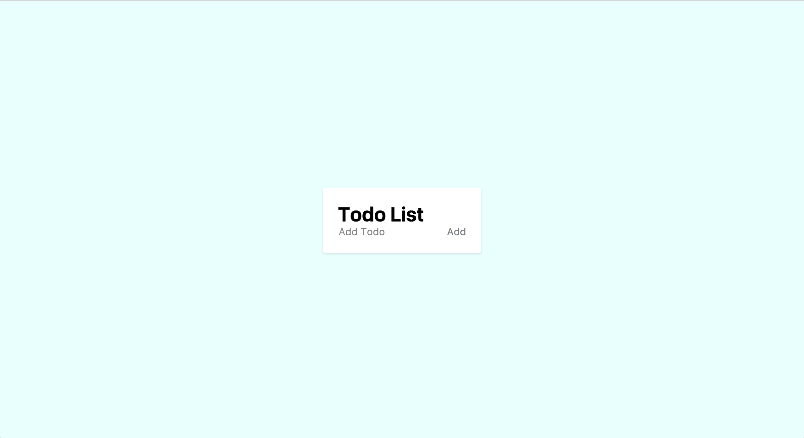
We can now see that we've got everything working correctly by checking out our screen.
As you can see, the example component is rendering correctly and we're good to go. If you feel like you've missed something along the way, feel free to check out the GitHub repo for this project and follow along with my commits.
Now to set up Tailwind, I'm going to assume that you've worked through my earlier article that explains how to set up Tailwind in a Laravel project. After we've done all that, let's add one more line to our welcome.blade.php so we can use our Tailwind styles. In the head below the title tag, add this import: <link href="{{ asset('css/app.css') }}" rel="stylesheet">.
Finally, we're ready to start developing!
Our Vue.js Component
Let's start our Vue development by taking out the scaffolding and adding our own components. In resources/assets/js/components, we can delete the ExampleComponent.vue and add our own file called todo.vue. Now, inside of resources/assets/js/app.js we can update the component import to reference our todo component instead of the example so it looks like this:
Vue.component('todo-component', require('./components/todo.vue'));
In our welcome.blade.php, we can update the Vue component to be our todo component like so:
<todo-component></todo-component>
To see this in the browser, we'll need to run our Laravel Mix. If you're following along, I recommend using npm run watch so your code changes automatically get compiled.
We're going to try and keep this Vue component pretty simple, so we can focus on styling it with Tailwind. For our template, let's use something that looks like this:
<template>
    <div>
        <div>
            <h1>Todo List</h1>
            <div>
                <input v-model="newTodo" placeholder="Add Todo">
                <button @click="add" :disabled="newTodo.length === 0">Add</button>
            </div>
        </div>
        <div>
            <div v-for="(todo, index) in todos" :key="todo.id">
                <p>{{todo.text}}</p>
                <button @click="updateStatus(todo)" v-text="todo.finished ? 'Not Done' : 'Done'"></button>
                <button @click="remove(index)">Remove</button>
            </div>
        </div>
    </div>
</template>
As you can see, this is a pretty simple component. We have a wrapper div like all Vue components, and then two child divs. In the first one we have our header, which includes our new todo input. We've bound that input to a v-model called newTodo and we've added a method to our button called add to submit a new todo. We're also disabling the button when there's no text in the input so we don't add empty todos.
In our bottom div, we're looping through each of the todos that we've added and we're displaying it's text data as well as two buttons. The first button let's us mark a todo as finished or not finished, while our second button removes the todo altogether. Pretty straightforward, right?
Moving along, here's the rest of our Vue component:
<script>
    export default{
        data(){
            return{
                todos: [],
                newTodo: '',
                baseId: 1,
            }
        },
        methods: {
            add() {
              const t = this;

              let todo = {
                id: t.baseId,
                text: t.newTodo,
                finished: false,
              }

              t.todos.push(todo);

              t.newTodo = '';
              t.baseId++;
            },
            updateStatus(todo) {
              todo.finished = !todo.finished;
            },
            remove(index) {
              const t = this;

              t.todos.splice(index, 1);
            }
        }
    }
</script>
Here we have the data that we're using to manage our todos and the three methods that we saw were bound to our template. In our data, we have a todos array where we can store our todos; we have the newTodo that we bound to our input, and lastly, we have a baseId that we're using to give each of our todos a fake "unique" id so Vue can keep track of them in the v-for loop.
In our methods, we have add() which instantiates a new todo with the data from newTodo and the baseId, and pushes it into our todo array before restoring the state of our input to empty and incrementing our baseId. Then we have updateStatus() that just flips the finished state of the passed in todo. Finally, we have remove() which accepts the index of a todo and splices it out of the todos array.
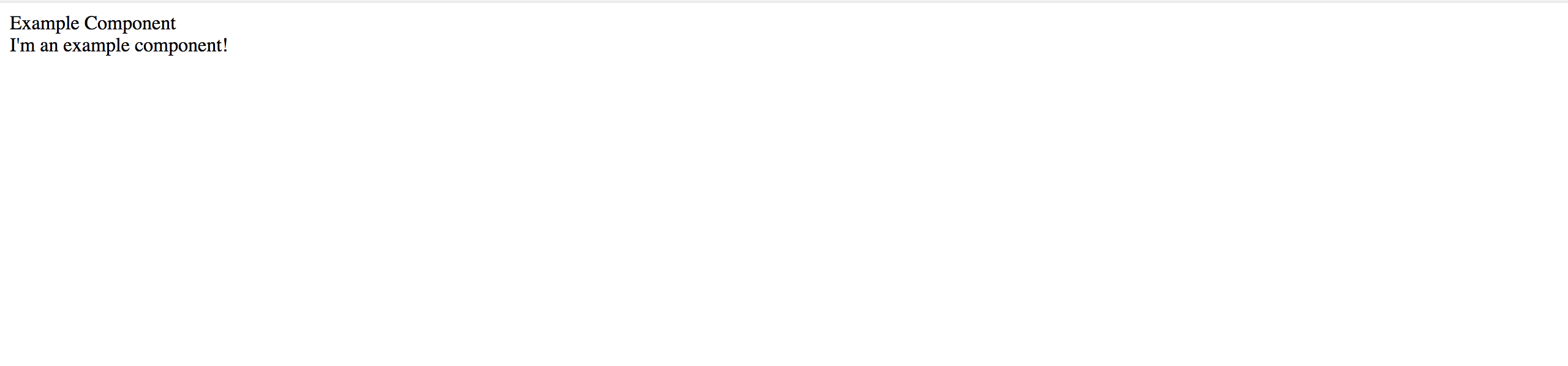
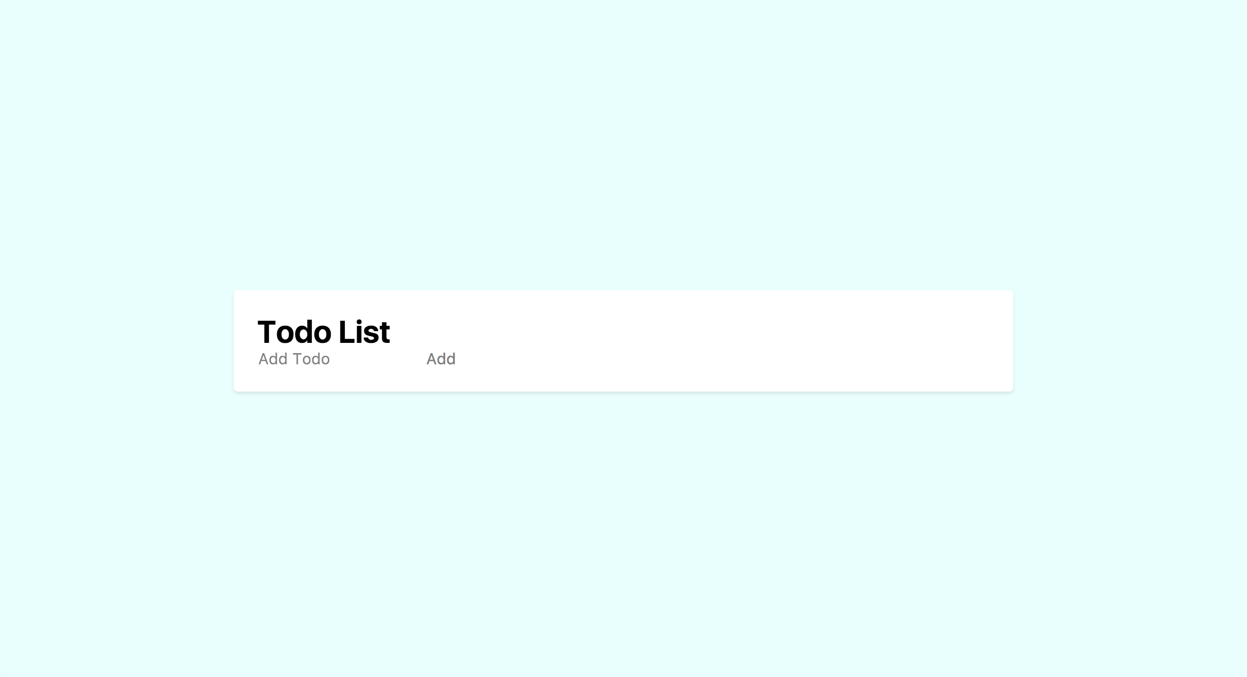
Running npm run prod, we can see what our todo component looks like in the browser.
As we use our component, we can see that our todos are getting added in the wrong order. Whoops! In our add() method, let's change the .push() to use .unshift() instead. Now, it's working as intended.
While the functionality is all there, it sure is tough to look at. Let's get ready to make it much more user-friendly with Tailwind CSS.
Looking Good with Tailwind
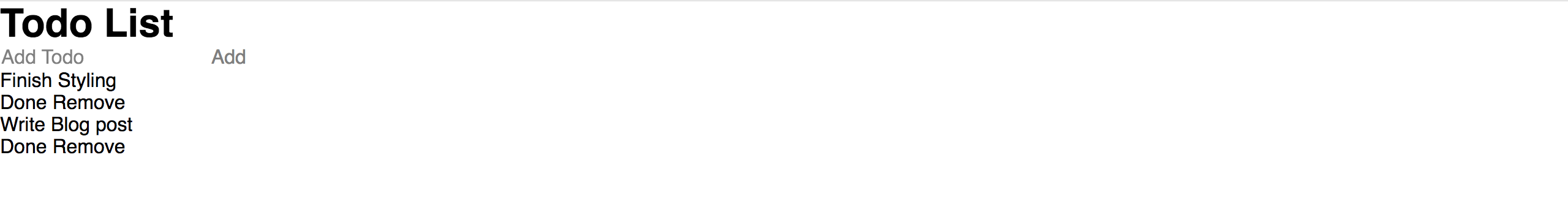
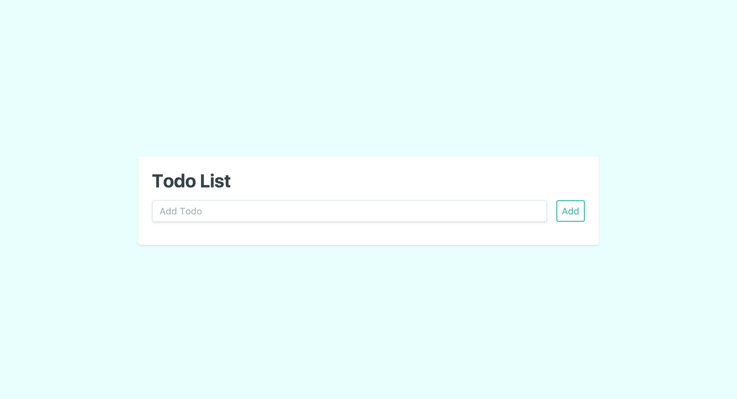
Here comes the fun part, making our todo app look awesome with Tailwind. To start, let's begin in welcome.blade.php and position our todo component in the middle of the page.
On the div with the id of app, we can add the following. class="h-screen flex items-center justify-center". As you can see, this puts our component right in the middle of the page. Let's add a background color and a font family to introduce some basic styles. On that same div add the .bg-teal-lightest and .font-sans classes. Our page is starting to look better already!
Now, we can focus on styling our component. Let's start with some basic styles so we can see what we're working with. Inside our todo.vue file on the wrapper div, we can add .bg-white, .rounded, .shadow, and .p-6 classes to give ourselves a nice looking card.
With that white background, we can see how that div sits on the page. So, let's give it a better width with these classes: .m-4, .w-full, .lg:w-3/4, and .lg:max-w-lg. As you can see, on mobile we're letting the card take up the full width of the screen, and once we hit our large breakpoint we let it grow until it hits 75% of the screen or our max-width.
Let's take care of the todo list itself, starting with the header. For the header wrapper div, we can just add a little spacing to the bottom with .mb-4 to separate it from the list items. Then on the h1 we can just add a .text-grey-darkest so it doesn't look so intense.
Now for the fun part, our new todo input. For its wrapper div, we'll make it flex by adding the .flex class and give it some spacing from the h1 with a .mt-4. On the input and the button we're going to add a whole bunch of classes like so:
<input class="shadow appearance-none border rounded w-full py-2 px-3 mr-4 text-grey-darker" v-model="newTodo" placeholder="Add Todo">
<button class="flex-no-shrink p-2 border-2 rounded text-teal border-teal hover:text-white hover:bg-teal" @click="add" :disabled="newTodo.length === 0">Add</button>
These classes are all pretty straight forward, but the ones that might trip you up are .appearance-none on the input and .flex-no-shrink on the button. .appearance-none is a reset class that removes any browser styling from a given element, while .flex-no-shrink is a flex helper that sets flex-shrink to 0 and prevents the button text from wrapping on smaller viewports. Pretty useful, right? Now, we've got ourselves a nicely styled header.
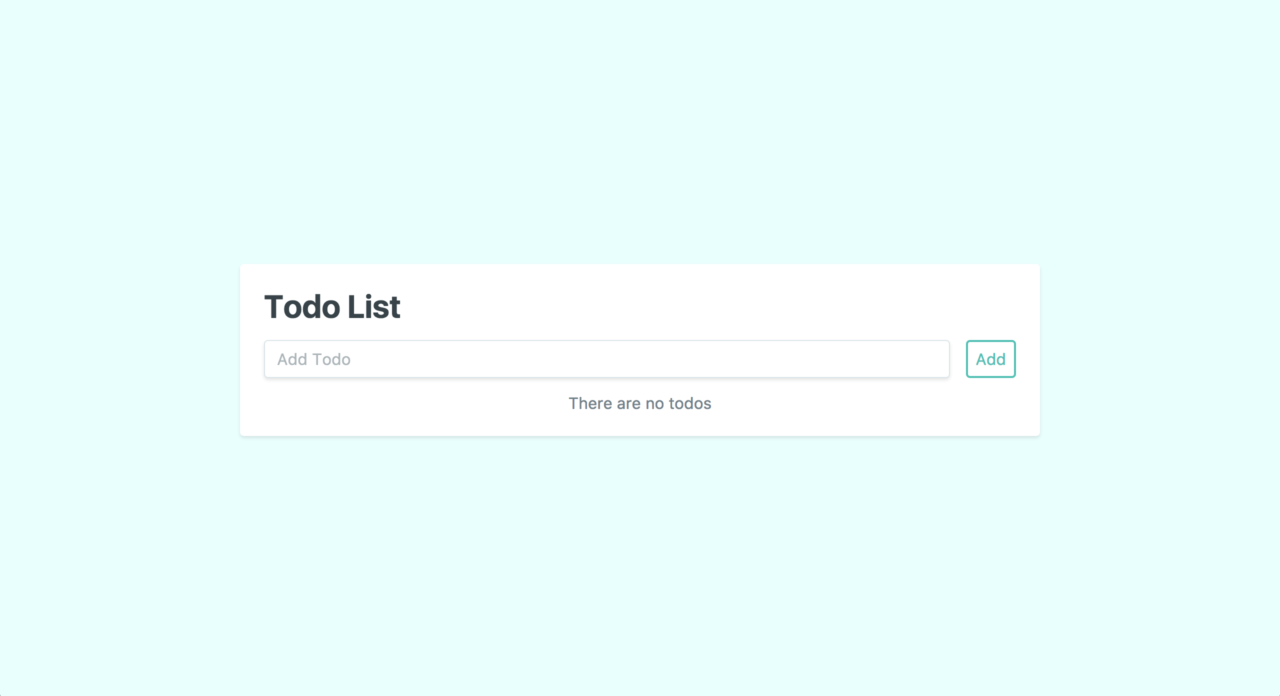
Before we style the todo items, this new styling is making it apparent that we forgot an empty state to let the user know that they don't have any todos. So, let's add that and style it too.
Inside of our second div group and right below the v-for, we can add this:
<div v-show="todos.length === 0">
    <p class="w-full text-center text-grey-dark">There are no todos</p>
</div>
Now our user can see that there are no todos right off the bat.
Finally, we just need to style our todo items. We can skip the wrapper div and jump directly to our v-for. Once again, we're going to add a whole bunch of classes. So, let's take a look at the finished result and then go over it.
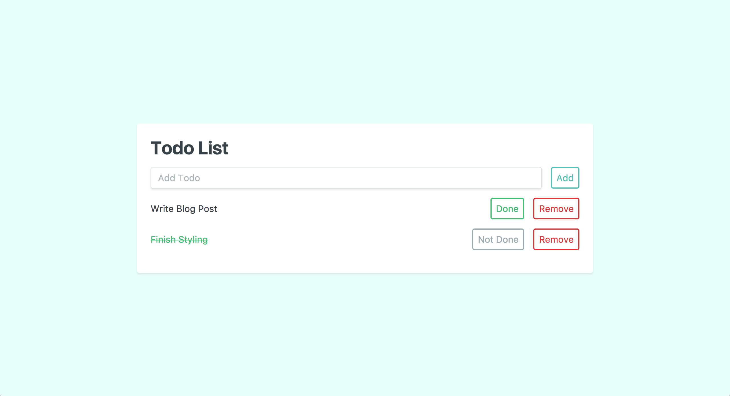
<div class="flex mb-4 items-center" v-for="(todo, index) in todos" :key="todo.id">
    <p class="w-full" :class="todo.finished ? 'line-through text-green' : 'text-grey-darkest'">{{todo.text}}</p>
    <button class="flex-no-shrink p-2 ml-4 mr-2 border-2 rounded hover:text-white" :class="todo.finished ? 'text-grey border-grey hover:bg-grey' : 'text-green border-green hover:bg-green'" @click="updateStatus(todo)" v-text="todo.finished ? 'Not Done' : 'Done'"></button>
    <button class="flex-no-shrink p-2 ml-2 border-2 rounded text-red border-red hover:text-white hover:bg-red" @click="remove(index)">Remove</button>
</div>
It's all pretty simple stuff, but we are doing one or two unique things. On the v-for div, we're just making it a flex element, aligning the items in the center, and adding some spacing to the bottom.
The p tag might look simple, but we've actually leveraged Vue's dynamic classes to toggles our classes to show our users that they have completed a todo. In the unfinished state, we're just coloring the text dark grey with .text-grey-darkest. But, in the finished state, we flip the color to green and add a strikethrough with .text-green and .line-through.
For our buttons, we're leveraging some of the classes we added to the "Add" button earlier, while also taking advantage of Vue's dynamic classes. I'll leave it as an exercise to you to parse out what exactly we're doing here.
Bada bing, bada boom we've finally finished styling our todo list!
The Wrap Up
Whew! We certainly covered a lot here, and we're really just getting started. In this post, we set up our Laravel, Vue, and Tailwind project; built a todo component with Vue.js, and then styled it with Tailwind.
For our next post, we've certainly got a lot more to cover. We have to persist our todos to a database, and we should probably extract some of our Tailwind classes into our own stylesheets so we can manage this component a bit easier.
Thanks for sticking with me throughout this tutorial. I hope it showed you some of the great things you can do with Tailwind, Vue, and Laravel. Feel free to check out this project on Github. As always, feel free to ask me any questions on Twitter. And until next time, happy coding!