Last week, we started building our comments system with some Vue.js components.
Now that we have our functionality in place let's style everything with Tailwind CSS. If you'd like to follow along, feel free to check out the repository on GitHub.
Where To Start?
When we're styling a new component or page, we typically have two obvious places to start. We can style all of the little page elements atomically, or we can start with the big picture and get the page layout done.
I find that I'll take the atomic approach on an established project where I have a better sense of what each element should look like, and because my layout is usually fixed by then. On a more greenfield project like this one, I find myself drawn to creating the layout first because I find that having a layout helps me design a better visual hierarchy for the page elements.
In your projects, it's always a great idea to make a note of your development patterns and style. There's no right or wrong approach, just your way of doing things. So, developing an understanding of your behavior helps you be consistent in your approach while also highlighting areas that could use improvement or experimentation.
For this project, let's start with our page layout and work from there.
Laying Out The Page
Since we're working from the outside in, we can start all the way at the beginning with our <body> tag inside of app.blade.php. Now, we shouldn't necessarily use the <body> for helping with the layout. Because, when we use a template system like blade or Vue and then use the <body> for layout, we can find ourselves designed into corners where different templates break the initial layout.
Next thing you know, we have a couple of different top-level layout templates, and our project is much harder to maintain. That said, we can use the <body> for styles that we'll use throughout our project. For us, that means we can add the font family here, and we'll also apply a slightly off-white background color.
Whenever we're looking to level up a design, picking a high-quality font is a great place to start. For this project, let's use the Nunito font. To add it to our project, we'll import it at the top of our app.sass file, and we'll modify our Tailwind config to add a class for it.
//app.sass
@import url('https://fonts.googleapis.com/css?family=Nunito:300,400,400i,700')

//tailwind.js
fonts: {
    ...
    'nunito': [
        'Nunito',
        'sans-serif',
    ]
},
If we run npm run watch, we'll compile our new class into our stylesheet and watch for any other changes we make.
Heading back to app.blade.php, we can add .bg-grey-lightest and .font-nunito to our <body>.
//app.blade.php
<body class="bg-grey-lightest font-nunito">
    ...
</body>
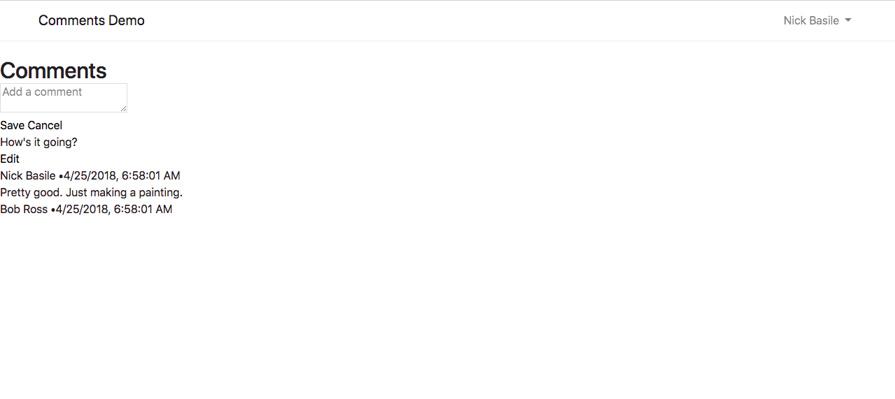
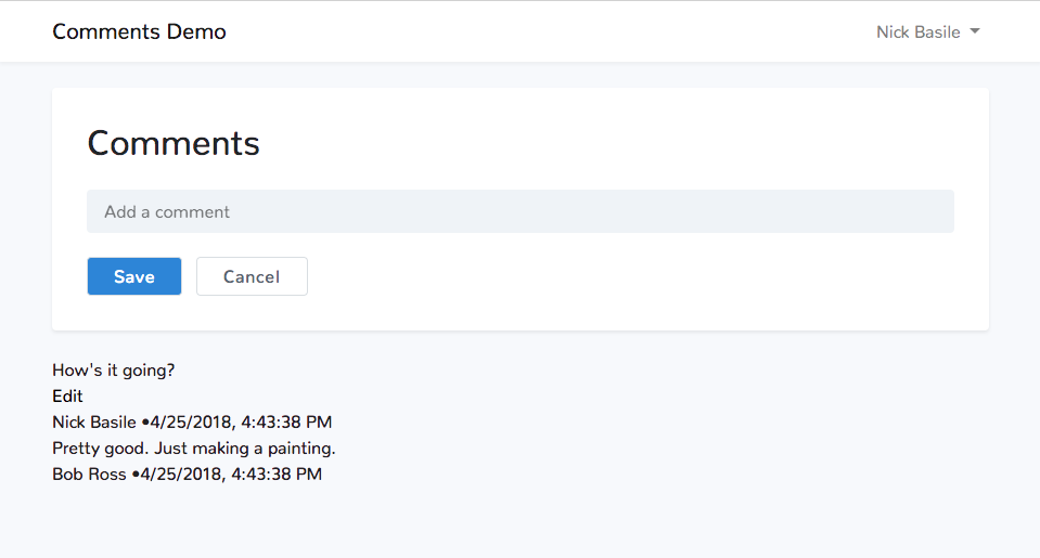
Looking at our browser now, we can see that our page is already starting to come together!
Adding a simple, off-white background color adds a bit of contrast to the page and helps the nav and content stand out. And our Nunito font makes the typography rounder, smoother, and a bit friendlier.
Now we can move onto our <nav>. Out-of-the-box, Laravel hooks us up with the latest version of Bootstrap and provides some default styling. For the most part, it's pretty good. We'll make a few tweaks to make it line up better with our comments.
On the <nav>, we can add .px-5 to add some whitespace around the edges. Then, inside of the <nav> we can see a <div> with a class of .container. On this <div> we'll add .max-w-3xl and .p-0 to override the .container's styles.
//app.blade.php
<nav class="navbar navbar-expand-md navbar-light navbar-laravel px-5">
    <div class="container max-w-3xl p-0">
        ...
    </div>
</nav>
This is an excellent example of how we can use Tailwind in conjunction with Bootstrap to get the customization our project needs. Before we hop into our Vue files, we have one more class left in app.blade.php.
Pro Tip: If you're going to be mixing Bootstrap and Tailwind extensively, make sure you enable the Tailwind prefix because they share a few class names.
On the <main> tag, we'll add .px-5 to give our content the same padding as our <nav>.
//app.blade.php
<main class="py-4 px-5">
    @yield('content')
</main>
Just like that, we have the bulk of our layout taken care of, and we didn't have to write any CSS to customize Bootstrap!
Styling The Add Comment Form
With our layout mostly taken care of, let's move onto styling our comments. We can start by styling our "Add Comment" form, but before that, we have one more layout style to finish.
Hoping into CommentsManager.vue, we can add .max-w-3xl and .mx-auto to the outermost <div> so it stays centered on our page.
//CommentsManager.vue
<template>
    <div class="max-w-3xl mx-auto">
        ...
    </div>
</template>
Inside of our wrapper <div>, we have two other <div>s. We'll focus on the first one for now. Let's start by adding a few classes to that <div> to make it look like a distinct entity on the page.
//CommentsManager.vue
<template>
    <div class="max-w-3xl mx-auto">
        <div class="bg-white rounded shadow-sm p-8 mb-4">
            ...
        </div>
        ...
    </div>
</template>
Inside of here, we have the header section enclosed in a <div>. Let's give that some vertical spacing and make the <h2>'s color a little less intense.
//CommentsManager.vue
<div class="bg-white rounded shadow-sm p-8 mb-4">
    <div class="mb-4">
        <h2 class="text-black">Comments</h2>
    </div>
    ...
</div>
Lately, I've been enjoying using Steve Schoger's approach to form inputs where he makes them grey instead of messing with the border colors. This does an excellent job of making the inputs easier to read and more distinct on the page. So, let's take that approach with our <textarea>.
//CommentsManager.vue
<div class="bg-white rounded shadow-sm p-8 mb-4">
    <div class="mb-4">
        <h2 class="text-black">Comments</h2>
    </div>
    <textarea v-model="data.body"
              placeholder="Add a comment"
              class="bg-grey-lighter rounded leading-normal resize-none w-full h-10 py-2 px-3">
    </textarea>
    ...
</div>
Finally, we're ready for our <buttons>! Let's make the primary action distinct and the secondary one a bit more subtle.
//CommentsManager.vue
<div class="bg-white rounded shadow-sm p-8 mb-4">
    <div class="mb-4">
        <h2 class="text-black">Comments</h2>
    </div>
    <textarea v-model="data.body"
              placeholder="Add a comment"
              class="bg-grey-lighter rounded leading-normal resize-none w-full h-10 py-2 px-3">
    </textarea>
    <div class="mt-3">
        <button class="border border-blue bg-blue text-white hover:bg-blue-dark py-2 px-4 rounded tracking-wide mr-1" @click="saveComment">Save</button>
        <button class="border border-grey-darker text-grey-darker hover:bg-grey-dark hover:text-white py-2 px-4 rounded tracking-wide ml-1">Cancel</button>
    </div>
</div>
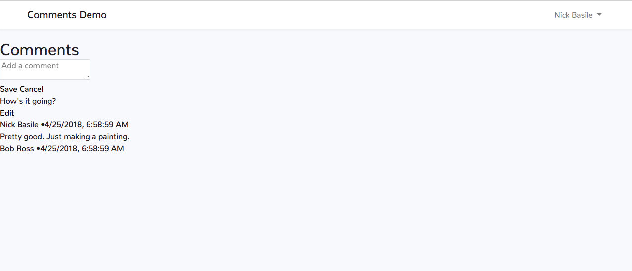
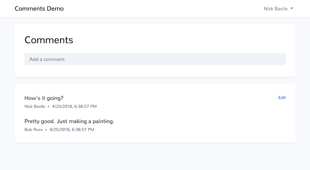
Let's take a peek at our browser and see what we're working with.
Mamma mia, that is a beautiful looking form. Now at this point, I hope you have one big question for me, "What the heck is that Cancel button there for?" Let's take care of that right now.
Wiring Up The Cancel Button
Vue.js sneaking into the Tailwind section of this series, what blasphemy! I left it to this point because we'll use it to make a UI upgrade instead of for a core piece of functionality. We're going to be leveraging Vue's dynamic classes to expand the <textarea> when the user is ready to add a comment and then the cancel button to exit that state.
Let's start off by adding a state property to our data.
//CommentsManager.vue
data: function() {
    return {
         state: 'default',
        data: {
            body: ''
        },
        comments: [
            {
                id: 1,
                body: "How's it going?",
                edited: false,
                created_at: new Date().toLocaleString(),
                author: {
                    id: 1,
                    name: 'Nick Basile',
                }
            },
            {
                id: 2,
                body: "Pretty good. Just making a painting.",
                edited: false,
                created_at: new Date().toLocaleString(),
                author: {
                    id: 2,
                    name: 'Bob Ross',
                }
            }
        ]
    }
},
Now we can add some methods to toggle the edit state. We can also update our saveComment() method to use our new methods.
//CommentsManager.vue
methods: {
    startEditing() {
        this.state = 'editing';
    },
    stopEditing() {
        this.state = 'default';
        this.data.body = '';
    },
    ...
    saveComment() {
        let newComment = {
            id: this.comments[this.comments.length - 1].id + 1,
            body: this.data.body,
            edited: false,
            created_at: new Date().toLocaleString(),
            author: {
                id: this.user.id,
                name: this.user.name,
            }
        }

        this.comments.push(newComment);

        this.stopEditing();
    }
}
With those methods in place, we can start wiring up our template! We'll start by adding that dynamic class to our <textarea> to toggle the height of the element when we're editing. We'll also bind startEditing to the @focus event so we can update the state when the user starts writing.
We'll add a v-show to our <button>s wrapper <div> to hide them when we're not editing, and we'll wire up that mysterious Cancel button, so it starts working.
//CommentsManager.vue
<textarea v-model="data.body"
          placeholder="Add a comment"
          class="bg-grey-lighter rounded leading-normal resize-none w-full py-2 px-3"
          :class="[state === 'editing' ? 'h-24' : 'h-10']"
          @focus="startEditing">
</textarea>
<div v-show="state === 'editing'" class="mt-3">
    <button class="border border-blue bg-blue text-white hover:bg-blue-dark py-2 px-4 rounded tracking-wide mr-1" @click="saveComment">Save</button>
    <button class="border border-grey-darker text-grey-darker hover:bg-grey-dark hover:text-white py-2 px-4 rounded tracking-wide ml-1" @click="stopEditing">Cancel</button>
</div>
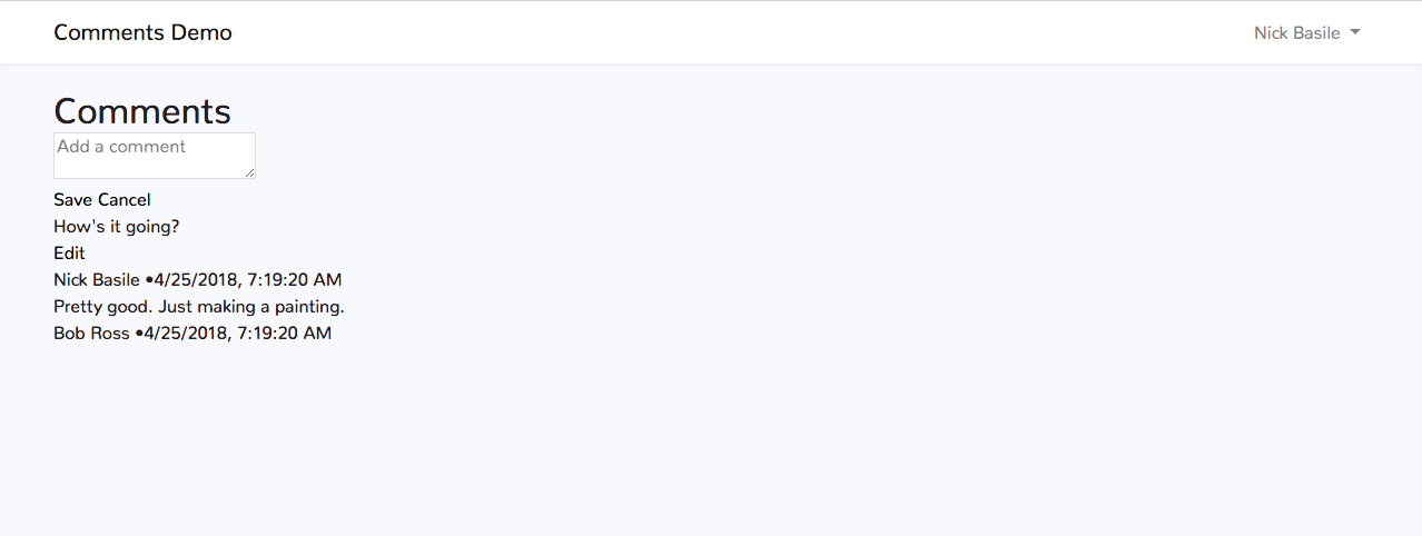
Hopping back into our browser, we can see that the buttons are now hidden until we focus on our <textarea>. I think this is a nice UI pattern because it doesn't clutter the interface with too much information, but it still provides that additional detail when the context needs it.
Now, let's finish styling the rest of our comments.
Styling The Comments
Once again, we'll start from the outside in. Inside of CommentsManager.vue, we have a <div> wrapping our CommentItems. We'll start by adding the background classes that we used on the "Add Comment" form to this. We'll also start tracking the index in the v-for and use another dynamic class to apply some margin-bottom to every CommentItem except the last one.
//CommentsManager.vue
<div class="bg-white rounded shadow-sm p-8">
    <comment v-for="(comment, index) in comments"
             :key="comment.id"
             :user="user"
             :comment="comment"
             :class="[index === comments.length - 1 ? '' : 'mb-6']"
             @comment-updated="updateComment($event)"
             @comment-deleted="deleteComment($event)">
    </comment>
</div>
With the wrapper <div> taken care of, we can hop into CommentItem.vue to take care of the comment styles. We'll start with the comment itself. We can add some positioning classes to its wrapper <div>, then we'll style the text itself, and finally we can add some styling to the Edit button as well.
//CommentItem.vue
<div class="flex justify-between mb-1">
    <p class="text-grey-darkest leading-normal text-lg">{{comment.body}}</p>
    <button v-if="editable" @click="state = 'editing'" class="ml-2 mt-1 mb-auto text-blue hover:text-blue-dark text-sm">Edit</button>
</div>
Moving right along, we can style the meta info next. We'll add some text styling and make sure the bullet span is a little smaller and spaced nicely.
//CommentItem.vue
<div class="text-grey-dark leading-normal text-sm">
    <p>{{comment.author.name}} <span class="mx-1 text-xs">•</span> {{ comment.created_at}}</p>
</div>
Heading back to our browser, we can see that our comments have come to life!
All we have to do now is style the update form. This will be pretty similar to our "Add Comment" form, but we'll make sure to give the <textarea> a non-dynamic height and style the delete button a bit differently than the other buttons.
//CommentItem.vue
<div v-show="state === 'editing'">
    <div class="mb-3">
        <h3 class="text-black text-xl">Update Comment</h3>
    </div>
    <textarea v-model="data.body"
              placeholder="Update comment"
              class="bg-grey-lighter rounded leading-normal resize-none w-full h-24 py-2 px-3">
    </textarea>
    <div class="flex flex-col md:flex-row items-center mt-2">
        <button class="border border-blue bg-blue text-white hover:bg-blue-dark py-2 px-4 rounded tracking-wide mb-2 md:mb-0 md:mr-1" @click="saveEdit">Update</button>
        <button class="border border-grey-darker text-grey-darker hover:bg-grey-dark hover:text-white py-2 px-4 rounded tracking-wide mb-2 md:mb-0 md:ml-1" @click="resetEdit">Cancel</button>
        <button class="text-red hover:bg-red hover:text-white py-2 px-4 rounded tracking-wide mb-2 md:mb-0 md:ml-auto" @click="deleteComment">Delete</button>
    </div>
</div>
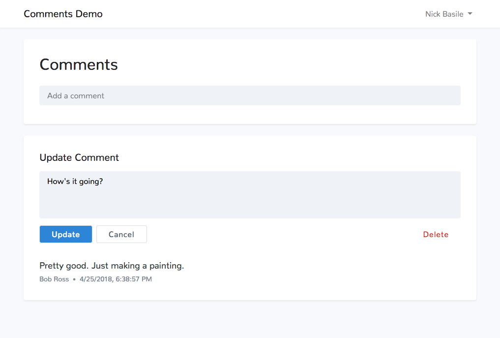
Bada bing bada boom, we have ourselves some styled comments.
The Wrap-Up
Every time I get to make a UI from scratch with Tailwind, I'm always blown away by how fast and straightforward it is. We didn't write any custom CSS, we worked with another framework, and we have some awesome looking comments.
Now that our styling is done, in the next post, we can work on using Laravel and MySQL to persist our comments. As always, feel free to ask me any questions on Twitter. And until next time, happy coding!